
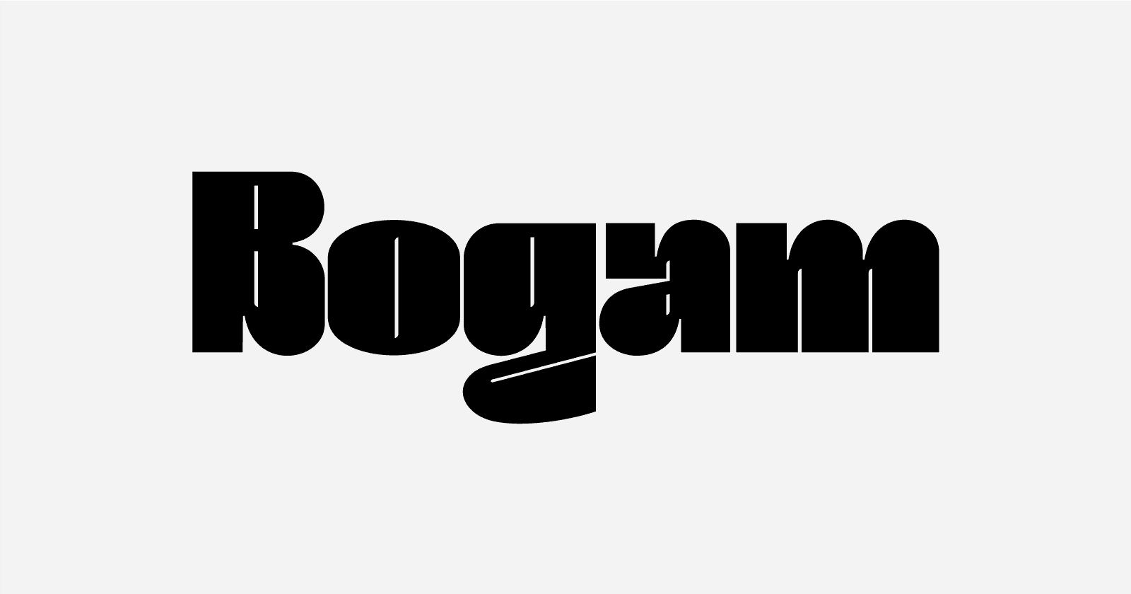
‹Bogam› features a bold typeface specifically crafted as a headline display font. With its unique and catchy form, it is perfectly suited as a wordmark for a band seeking a design that is bold and playful yet still assertive. The name ‹Bogam› is inspired by the capital letter ‹G› in the ‹Bogam› font. Its shape resembles a clenched fist as if poised to punch, an expression colloquially referred to as ‹Bogem› in everyday language, which was then playfully adapted into ‹Bogam› to sound more comfortable and fitting, as well as easier to pronounce for international customers.
❦
‹Bogam› memiliki bentuk font yang tebal, yang memang dibuat sebagai headline display font. Dengan bentuk yang unik dan catchy pas digunakan sebagai wordmark sebuah band yang menginginkan bentuk tebal dan lucu tapi tetap tegas. Nama ‹Bogam› terinspirasi dari huruf kapital ‹G› dalam font ‹Bogam›. Bentuknya seperti jari yang mengepal seperti sedang ingin meninju dan hal ini dalam bahasa sehari hari disebut ‹Bogem› dan diplesetkan menjadi ‹Bogam› agar lebih nyaman dan pas serta sesuai dengan pengucapan costumer dari luar negeri.
— Bogam is designed by Reza Rasenda and Riska Chandra Dewi of Bagerich.