In my childhood there were still lots of bits and pieces left of Interbellum Norway, at least visually: Tobacco logos and sweets wrappers, hand lettering, road signs and train stations, even mastheads on newspapers and magazines—it took quite a while before 30’s functionalism left Norway, never to be seen again. Those letter shapes formed my idea of how letters are supposed to look.
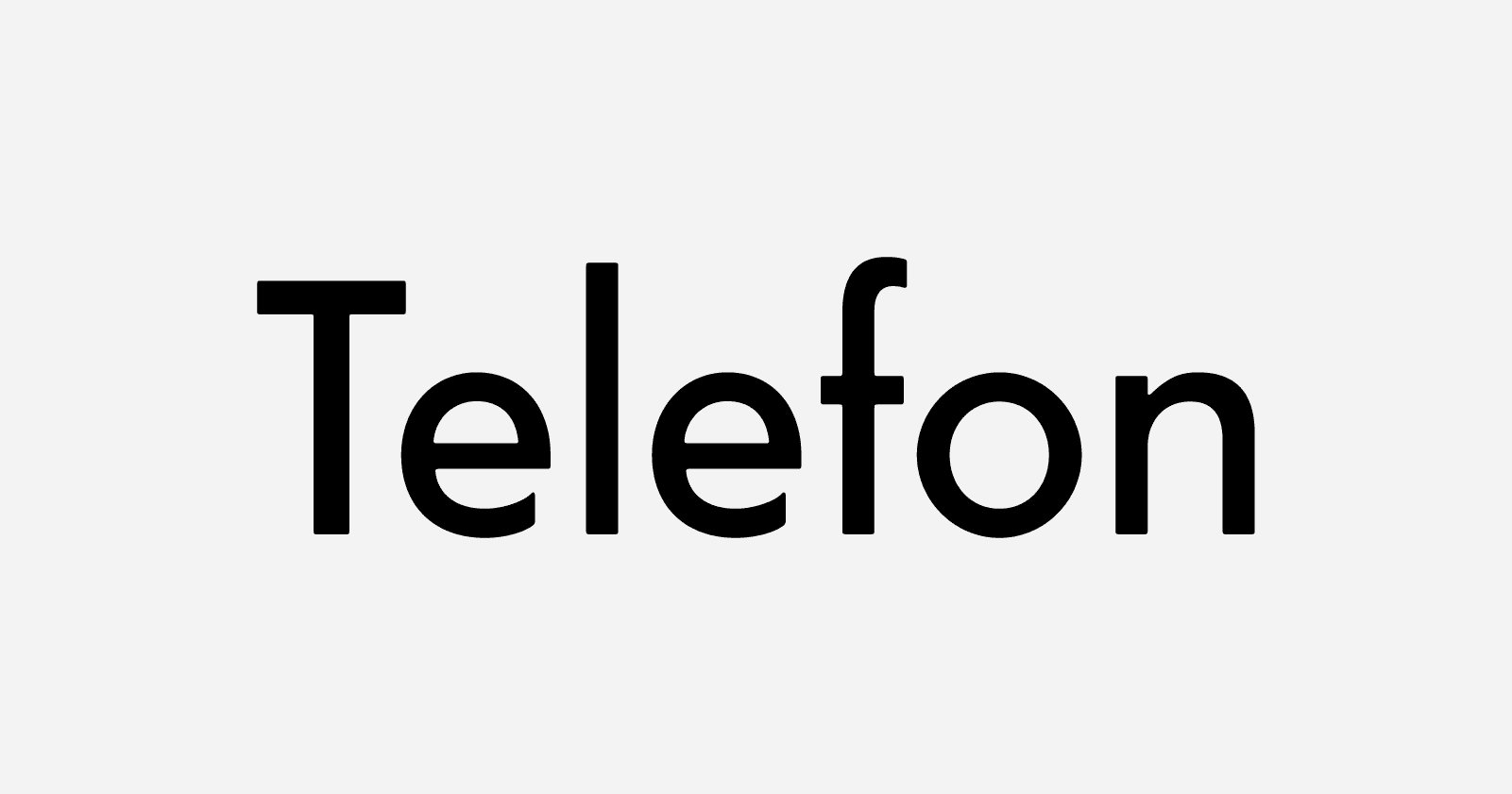
‹Telefon› started with a Christmas gift from my daughter: A book on the original, iconic Norwegian telephone booths, with good pictures, but sadly set in Helvetica. The original lettering was different from that on the remaining ones—someone filed down those gorgeous ‹N› spikes and neutralised the ‹E› and ‹F› crossbars, probably in the 60’s. But my memories of the weird geometry of those six letters ‹TELEFON› (I deliberately didn’t look at them while drawing) became the inspiration for what eventually turned into a typeface.
When drawing type, I never make any sketches. I start drawing directly in the font editing program I use, often not having much of an idea what I am going to draw. ‹Telefon› was actually the result of me teaching myself how to construct a geometric typeface.
A good share of Norwegian street signs are still of that old variety; the typeface a weird cross between the DIN types and more geometric shapes, to some degree resembling Jakob Erbar’s eponymous typeface. The new ones are of course vastly inferior in all respects, since hardly anyone knows typography in Norway anymore.
‹Telefon› is my first completed design, which probably makes me a member of the not-so-exclusive club of type designers who choose some kind of geometric sans serif as their first typeface. However, it is easy to underestimate the challenge of making a geometric typeface readable, attractive and interesting. In fact, it is very hard. I’ve tried redeeming ‹Telefon› by making it friendlier than Futura: the proportions are less severe, the corners are soft, the two-storey ‹a› and the rather loose spacing makes it useful for more than display typography. You could even set a book in ‹Telefon›; it would actually be the perfect choice the next time someone writes a book on the Norwegian telephone booth.
— Telefon is designed by Sindre Bremnes of Monokrom.