
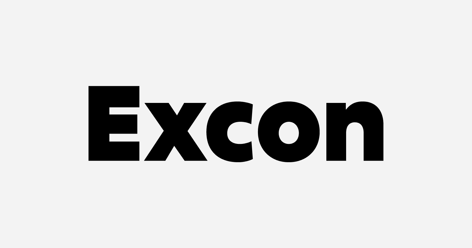
Alisa Nowak’s ‹Excon› is a versatile six-weight family of sans serif fonts; it is also a tribute to the work of the master French designer Roger Excoffon (1910–1983). ‹Excon›’s letters are top-heavy, a rarely-explored idea in type design Excoffon himself experimented with decades ago. He was followed in this later by a few colleagues in The Netherlands. By referencing Excoffon’s style, ‹Excon›’s design drinks from the fountain of French-style sans serifs from the 1950s and 60s. ‹Excon› is an excellent choice for corporate identity and editorial design work.
The typeface’s letters include some stroke contrast—otherwise their top-heaviness would not be visible—and other typical mid-20th-century traits, like its mixing of a double-storey ‹a› with a single-storey ‹g›. The stroke contrast is dialled-down in the family’s lightest Thin weight, but by the Black, the contrast is quite pronounced in many characters. ‹Excon›’s lowercase has a tall x-height, paired with ascenders that are noticeably taller than the capital letters. Its numerals are proportionally-spaced, and drawn to be as tall as ‹Excon›’s caps.
— Excon is designed by Alisa Nowak of Fontshare.